How to match colors interior design?
Like the green that most people like, take green as an example. The indoor color trend is mainly set in dark green, which brings people into a peaceful moment.
Through three sets of dark green toned scenes, it brings us an explanation of the color wheel. With quiet tones and low-key background colors, the peaceful and pleasant color series express color cooperation and collaboration, just like the dark green tone from the forest, adding low-saturation gray to enhance the three-dimensional sense of the space and the advanced level sense.
The introverted years precipitated, the lightness of the baptism of time, and the inherent light and luxurious temperament, unabashedly presents itself before your eyes, creating a light, luxurious and exquisite fashion sense.
Color is an important element in home design. The creation of home atmosphere depends on color. Fully automatic toning can create a variety of rich colors to meet people's personalized wall customization needs.
When designing the interior, the color matching in the space, the following rules can be followed.
1 The proportion of gold color matching 70%: 25%: 5%
70% of the basic colors include walls, floors, and ceilings. Under normal circumstances, the three colors in the same space should be controlled as far as possible to two, and no more than three at most.
The walls and ceilings are all white, and the floor chooses the original wood color. Under such a large background color, under such a large background color, soft decoration is easier to match. Because this is equivalent to the background color palette of a painting, a good painting can only be drawn if the background color is selected.
25%: 25% of the main color matching, mainly including furniture, curtains, carpets and other relatively large soft decoration parts
There are 2 different collocation rules:
Choosing the main color close to the basic color is the safest method;
Use relatively prominent colors for decoration. For example, many people now choose to lay a carpet under the coffee table as the finishing touch.
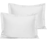
5%: 5% accent color. Accent colors can be presented through decorative paintings, pillows or ornaments.
For example, if the background color of your room is all-matched, you can unscrupulously use a variety of colors of bedding, and a solid color duvet cover set is the first choice. It feels clean and refreshing. At the same time you can choose the same color knitted cotton blanket.
2 Repeated accent colors
This is the most commonly used emphasis method in color matching, and it is also very simple to operate. Black, white, gray and blue. There are more cool colors than warm colors. In the home color matching, the use of white walls and gray tones creates a refreshing and clean visual effect.
3. Superposition of the same color system
Choose home furnishing items of the same color as the wall, which can be different in shades, but should generally be controlled within the same color system
The pale orange-pink wall, with a slightly deeper pillow and carpet, and a western-style floor lamp to add color, forms a layered warm color transition, which is a sense of harmony that is not monotonous.
5. Watch blockbusters, learn color matching, and find inspiration from movie color matching.
6. Looking for inspiration in life, natural colors are often the most beautiful.
There are thousands of colors in the world, and each of them has the potential to become the protagonist. Let you keep up with the trend and keep pace with fashion!


